

模块 'ThemePreviewer' 不存在
[[iftags +组件]]
这是什么
我用户 'Croquembouche' 不存在用在一大堆页面上的一大堆各种各样的CSS“改进”,因为我觉得这样就能使其更容易处理。
该组件做出了很多非常细碎的改动以使得写作体验更加舒服且能够使制作组件/版式更加容易一点(也就是我经常干的事)。它不会对读者来说在视觉上改变页面中的任何东西——这些改动是为作者服务的。
我不期望用了这个组件的文章的翻译版也会用到这个组件,除非那个翻译者也喜欢这个组件而且也想用这个组件之类的。
这个组件可能不会与其它组件或版式冲突,且即使会冲突,也可能不会有什么影响。
用法
在任意维基上:
[[include :scp-wiki:component:croqstyle]]
该组件被设计于与其它组件一同使用,所以-=-是用来隐藏该文档的。在另一个组件内使用时,请确保将该组件放在[[iftags]]块内,这样你的组件的用户就不会强制同样使用 Croq 风格。
相关组件
其它个人自定义组件(只会改变一点点东西):
- RSO组件 — 用户 'Rounderhouse' 不存在
个人自定义版式(在视觉上有大的变化):
- Magnus网络格式 — 用户 'DrMagnus' 不存在
- flop风格 CSS — 用户 'Lt Flops' 不存在
- 空白风格 CSS — 用户 'HarryBlank' 不存在
- 占位风格 CSS — 用户 'Placeholder McD' 不存在
CSS修改
大小合理的脚注
不让脚注达到一百万里那么宽,让你能确实地阅读脚注。
.hovertip { max-width: 400px; }等宽字体编辑/代码
使编辑文本框内字体等宽,且将所有等宽字文本改为Fira Code,也是个明显很优秀的等宽字字体。
@import url('https://fonts.googleapis.com/css2?family=Fira+Code:wght@400;700&display=swap');

:root { --mono-font: "Fira Code", Cousine, monospace; }
#edit-page-textarea, .code pre, .code p, .code, tt, .page-source { font-family: var(--mono-font); }
.code pre * { white-space: pre; }
.code *, .pre * { font-feature-settings: unset; }
电传打字机背景
给<tt>元素加上亮灰色的背景({{文本}}),使得代码片段更为突出。
tt {
  background-color: var(--swatch-something-bhl-idk-will-fix-later, #f4f4f4);
  font-size: 85%;
  padding: 0.2em 0.4em;
  margin: 0;
  border-radius: 6px;
}
不要大脸
禁用悬停于某人的头像的时候出现的大图片,因为这图片又蠢又真的很烦人,想看大头像版本的话直接点击一下就行了。
.avatar-hover { display: none !important; }碎裂碎裂
任何在带有nobreak类的div中的文本可以在字母间自动换行。
.nobreak { word-break: break-all; }代码颜色
将我终端中的代码颜色加为变量。可能我会在什么时候把它改成比如Monokai或者别的更加常见的终端主题,但是现在暂时这还是我的个人主题,是从Tomorrow Night Eighties中衍生而来的。
还有,将.terminal类像[[div class="code terminal"]]一样添加到假代码方块中可以让它有一个有点伪终端样的暗色背景。不能用在[[code]]中,因为Wikidot嵌入了一大堆语法来使其高亮,不用一大堆CSS是改不动的。只能用在非[[code]]的代码片段中。
:root {
  --c-bg: #393939;
  --c-syntax: #e0e0e0;
  --c-comment: #999999;
  --c-error: #f2777a;
  --c-value: #f99157;
  --c-symbol: #ffcc66;
  --c-string: #99cc99;
  --c-operator: #66cccc;
  --c-builtin: #70a7df;
  --c-keyword: #cc99cc;
}

.terminal, .terminal > .code {
  color: var(--c-syntax);
  background: var(--c-bg);
  border: 0.4rem solid var(--c-comment);
  border-radius: 1rem;
}
调试模式
将位于.debug-mode中的任何东西周围画上线。线的颜色是红色的但是遵从CSS变量--debug-colour。
你还可以将div.debug-info.over与div.debug-info.under添加到某个元素中以给调试框加注释——虽然你得确保有留下足够的垂直空间,让注释不会与其上方或下方的东西重叠。
……就像这样!
.debug-mode, .debug-mode *, .debug-mode *::before, .debug-mode *::after {
  outline: 1px solid var(--debug-colour, red);
  position: relative;
}
.debug-info {
  position: absolute;
  left: 50%;
  transform: translateX(-50%);
  font-family: 'Fira Code', monospace;
  font-size: 1rem;
  white-space: nowrap;
}
.debug-info.over { top: -2.5rem; }
.debug-info.under { bottom: -2.5rem; }
.debug-info p { margin: 0; }这是什么?
这个组件可以改变顶栏当中用户信息和搜索栏两部分的显示状态,使其变为可折叠并默认隐藏。
使用方法:
若需使用本组件,请在你页面的任意位置插入以下代码:
[[include :backrooms-wiki-cn:component:toggle-search-top-box]]
这个组件可以适配大部分版式的配色方案,遇到不能适配的少数场合(如采用亮色系版头的版式)可以额外引入以下代码修改配色:
无法获取插入的页面 ":backrooms-wiki-cn:component:layout-helpers wiki-note=true",可能是站点标识名有误,或您无权在该站点查看此页面
[[iftags +版式]]
这个版式由
 wd:syhx golden
修改自新阈限 黑色标记笔版式,是专门服务于个人使用的美学版式,参考了新版黑色标记笔版式的代码。虽然是个人使用,但是大家依然也可以用,若要在您的页面中使用本主题,将如下代码插入您页面中的任何位置:
[[include :thebackrooms-sy:banshi5]]
版式示例
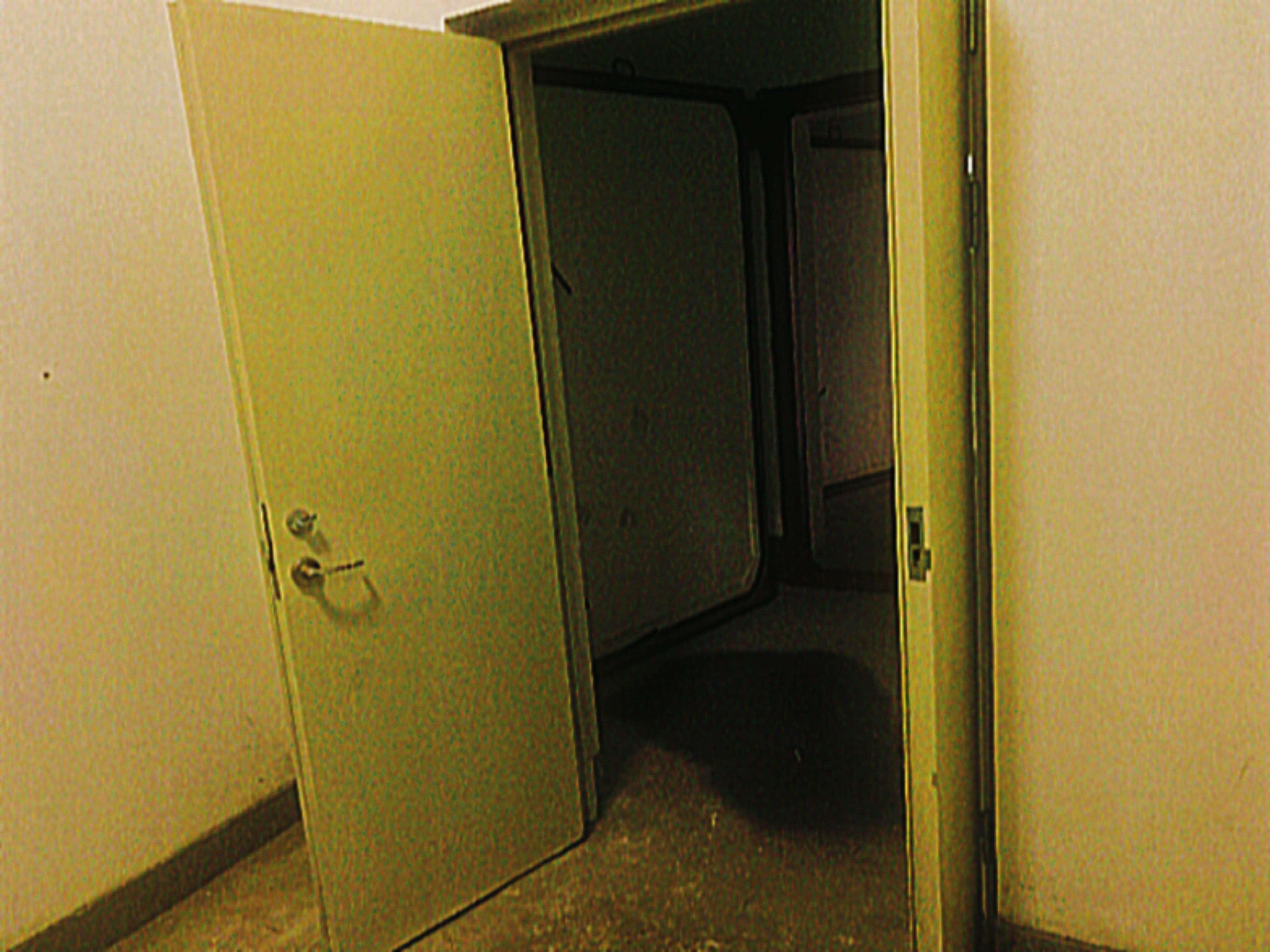
配图由用户 'L fainth' 不存在拍摄。
可以使用五个连字符"-----" 创建水平线,如果未将其放置在任何内容(例如引用块)中,则可以扩展到整个页面。分隔本文档各部分的行是水平线。
可以通过在行首加上1-6个之间的"+"字符来创建标题。
道之为物,惟恍惟惚。惚兮恍兮,其中有象;恍兮惚兮,其中有物。窈兮冥兮,其中有精;其精甚真,其中有信。自今及古、其名不去,以阅众甫。吾何以知众甫之状哉?以此。
看看我,我这有更多文字!
可真是古朴风格。
这是一个长分页,它能容纳很多字符。
这是一个长分页,它能容纳很多字符。
这是一个长分页,它能容纳很多字符。
这是一个长分页,它能容纳很多字符。
这是一个长分页,它能容纳很多字符。
这是一个长分页,它能容纳很多字符。
这是一个长分页,它能容纳很多字符。
这是一个长分页,它能容纳很多字符。
这是一个长分页,它能容纳很多字符。
这是一个长分页,它能容纳很多字符。
这是一个长分页,它能容纳很多字符。
这是一个长分页,它能容纳很多字符。
他真影响速切。
Never gonna give you up
这是一个引用块,在一行字的起始处加上“> ”来创建。
更多文字一条分割线
嵌套块引用1
| 这是一个 | 表格 |
|---|---|
| 你应该早就 | 知道怎么 |
| 制作它了吧 | |
脚2
这段文本
放在这里
你们就能
看到不同格式以及
其它东西
看起来是
怎么运作
[[[包括那些不存在]]]
以及存在的链接!
还有特殊警告
或者风险更低的
或者安全的!
引用和块:
Blocks:
[[div class="blockquote"]]
[[/div]]
[[div class="darkblock"]]
[[/div]]
[[div class="lightblock"]]
[[/div]]
Quote Blocks:
[[div class="styled-quote"]]
[[/div]]
[[div class="dark-styled-quote"]]
[[/div]]
[[module ThemePreviewer noUi="true" theme_url="https://bhl.scpwikicn.com/css/min/normalize.min.css"]]
[[module css]]
@import url("https://arandintday.github.io/thebackhubscn/bhl-new.css");
@import url('https://fonts.googleapis.com/css2?family=Ma+Shan+Zheng&display=swap');
:root,
:root:lang(cn) {
   --logo-image: url("http://backrooms-wiki.wikidot.com/local--files/component:theme/logo.svg");
   --header-title: "The Backrooms";
   --header-subtitle: "罔殆之途";
   --body-font: '微软雅黑', '等线', 'Noto Sans SC';
   --mono-font: 'Ma Shan Zheng', sans-serif;
}
:root {
        --white-monochrome: 255, 255, 255;
        --light-gray-monochrome: 66, 66, 72;
        --very-light-gray-monochrome:255, 255, 255;
        --bright-accent: 174, 174, 174;
        --dark-accent: 66, 66, 72;
        --medium-accent: 66, 66, 72;
        --black-monochrome: 48, 48, 52;
        --pale-accent: 66, 66, 72;
        --thing: 255, 255, 255;
        --header-gradient-color-bottom: 48, 48, 52;
        --header-gradient-color-middle: 66, 66, 72;
        --header-gradient-color-top: 66, 66, 72;
        --swatch-topmenu-bg-color: var(--light-gray-monochrome);
        --swatch-text-tertiary-color: var(--dark-gray-monochrome);
        --swatch-menubg-color: var(--gray-monochrome);
        --swatch-menubg-light-color: var(--pale-gray-monochrome);
        --swatch-menubg-medium-color: var(--light-gray-monochrome);
        --swatch-menubg-medium-dark-color: var(--black-monochrome);
        --swatch-menubg-dark-color: var(--dark-gray-monochrome);
        --swatch-menubg-black-color: var(--black-monochrome);
        --swatch-menubg-hover-color: var(--gray-monochrome);
        --swatch-menutxt-dark-color: var(--dark-accent);
        --swatch-menutxt-light-color: var(--white-monochrome);
        --swatch-border-color: var(--black-monochrome);
        --newpage-color: rgb(var(--dark-gray-monochrome));
        --pale-gray-monochrome:rgb(var(--write-monochrome));
        --dress-white:255, 255, 255 ;
        --scissor-blades: 197, 197, 212;
   --toggle-button-bg: rgb(var(--dark-gray-monochrome));
   --toggle-border-color: rgb(var(--scissor-blades));
   --toggle-icon-color: rgb(var(--dress-white));
   --toggle-roundness: 0%;
}
    #main-content {
        --editor-icon-color: var(--swatch-menutxt-dark-color);
        --editor-icon-hover-bg: var(--dark-accent);
        --tabs-txt: var(--swatch-text-tertiary-color);
        --tabs-hover-bg: var(--swatch-primary-darkest);
        --tabs-hover-txt: var(--swatch-text-secondary-color);
        --tabs-selected-bg: var(--swatch-primary-darker);
        --tabs-selected-txt: var(--swatch-text-secondary-color);
        --tabs-selected-outline: var(--swatch-primary-darker);
        --tables-header-bg: var(--light-gray-monochrome);
        --blockquote-colorbar-color: var(--swatch-primary-darker), 1;
        --pagetags-text-hover-color: var(--swatch-primary-darkest);
        --pagetags-title-bg: var(--gray-monochrome);
        --pagetags-text-color: var(--swatch-primary-darker);
        --pagetags-text-hover-color: var(--swatch-primary-darker);
        --pagetags-text-hover-bg-color: var(--swatch-background);
        --footnotes-footer-bg-color: 255,255,255;
        --footnotes-footer-colorbar-color: var(--gray-monochrome);
        --footnotes-footer-title-bg-color: var(--gray-monochrome);
    }
:root{
        --ui-button-bg: var(--swatch-alternate-color);
        --ui-button-txt: var(--swatch-text-secondary-color);
        --ui-button-hover-bg: var(--swatch-primary-darkest);
        --ui-button-hover-outline: var(--swatch-primary-darkest);
}

#page-content .collapsible-block-folded, #page-content .collapsible-block-unfolded-link {
    margin-top: 10px;
    padding-left: 1rem;
    padding-right: 1rem;
    box-shadow: rgb(128, 128, 128) 0px 0px 3px 0px;
    transition: background 0.2s linear;
    background: rgb(66, 66, 72);
    width: min-content;
    white-space: nowrap;
    overflow: hidden;
}
#page-content .collapsible-block-link {
    color: white;
    font-weight: bold;
}
#page-content .collapsible-block-link:hover {
    text-decoration: none
}/
#page-content .collapsible-block-content {
    border-bottom: solid 3px rgb(66,66,72);
    transition: border-top-color 0.2s linear;
    border-top: solid rgb(66, 66, 72) 5px;
}
#page-content .collapsible-block-unfolded .collapsible-block-link::before {
    content: "▽ ";
    border-right: none;
    padding-right: 0rem;
}
#page-content .collapsible-block-folded .collapsible-block-link::before {
    content: "▷ ";
    border-right: none;
    padding-right: 0rem;
}

#main-content .page-tags a[href^="/system:page-tags/tag/_"] {
    display: none;
}

#main-content .page-tags span {
    justify-content: flex-start;
}

#main-content .page-tags span a:-webkit-any-link:not([href^="/system:page-tags/tag/_"]) {
    --wght: 500;
    display: inline;
    position: relative;
    flex-grow: 0;
    width: -webkit-max-content;
    width: max-content;
    height: 1.175em;
    margin: 0 0 0 0.5125rem;
    padding: 0.1875rem 0.3125rem 0.1875rem 1rem;
    border-top-right-radius: 0.25rem;
    border-bottom-right-radius: 0.25rem;
    background: rgb(var(--swatch-menubg-dark-color));
    color: rgb(var(--swatch-menutxt-light-color));
    font-size: 0.6875rem;
    line-height: 0.8125rem;
    text-decoration: none;
    -webkit-clip-path: polygon(0.5rem 0, 100% 0, 100% 100%, 0.5rem 100%, 0 50%);
    clip-path: polygon(0.5rem 0, 100% 0, 100% 100%, 0.5rem 100%, 0 50%);
}

#main-content .page-tags span a:-moz-any-link:not([href^="/system:page-tags/tag/_"]) {
    --wght: 500;
    display: inline;
    position: relative;
    flex-grow: 0;
    width: -moz-max-content;
    width: max-content;
    height: 1.175em;
    margin: 0 0 0 0.5125rem;
    padding: 0.1875rem 0.3125rem 0.1875rem 1rem;
    border-top-right-radius: 0.25rem;
    border-bottom-right-radius: 0.25rem;
    background: rgb(var(--swatch-menubg-dark-color));
    color: rgb(var(--swatch-menutxt-light-color));
    font-size: 0.6875rem;
    line-height: 0.8125rem;
    text-decoration: none;
    clip-path: polygon(0.5rem 0, 100% 0, 100% 100%, 0.5rem 100%, 0 50%);
}

#main-content .page-tags span a:any-link:not([href^="/system:page-tags/tag/_"]) {
    --wght: 500;
    display: inline;
    position: relative;
    flex-grow: 0;
    width: -webkit-max-content;
    width: -moz-max-content;
    width: max-content;
    height: 1.175em;
    margin: 0 0 0 0.5125rem;
    padding: 0.1875rem 0.3125rem 0.1875rem 1rem;
    border-top-right-radius: 0.25rem;
    border-bottom-right-radius: 0.25rem;
    background: rgb(var(--swatch-menubg-dark-color));
    color: rgb(var(--swatch-menutxt-light-color));
    font-size: 0.6875rem;
    line-height: 0.8125rem;
    text-decoration: none;
    -webkit-clip-path: polygon(0.5rem 0, 100% 0, 100% 100%, 0.5rem 100%, 0 50%);
    clip-path: polygon(0.5rem 0, 100% 0, 100% 100%, 0.5rem 100%, 0 50%);
}

#main-content .page-tags span a:hover:not([href^="/system:page-tags/tag/_"]), #main-content .page-tags span a:active:not([href^="/system:page-tags/tag/_"]) {
    color: rgb(var(--swatch-menutxt-dark-color));
}

#main-content .page-tags span a:focus-within:not([href^="/system:page-tags/tag/_"]) {
    color: rgb(var(--swatch-menutxt-dark-color));
}

#main-content .page-tags span a:-webkit-any-link:not([href^="/system:page-tags/tag/_"])::after {
    content: "";
    position: absolute;
    top: 50%;
    left: 0.5rem;
    width: 0.25rem;
    height: 0.25rem;
    transform: translateY(-50%);
    border-radius: 50%;
    background: rgb(var(--swatch-background));
    box-shadow: -0.0625rem -0.0625rem 0.125rem rgb(var(--swatch-menubg-dark-color));
}

#main-content .page-tags span a:-moz-any-link:not([href^="/system:page-tags/tag/_"])::after {
    content: "";
    position: absolute;
    top: 50%;
    left: 0.5rem;
    width: 0.25rem;
    height: 0.25rem;
    transform: translateY(-50%);
    border-radius: 50%;
    background: rgb(var(--swatch-background));
    box-shadow: -0.0625rem -0.0625rem 0.125rem rgb(var(--swatch-menubg-dark-color));
}

#main-content .page-tags span a:any-link:not([href^="/system:page-tags/tag/_"])::after {
    content: "";
    position: absolute;
    top: 50%;
    left: 0.5rem;
    width: 0.25rem;
    height: 0.25rem;
    transform: translateY(-50%);
    border-radius: 50%;
    background: rgb(var(--swatch-background));
    box-shadow: -0.0625rem -0.0625rem 0.125rem rgb(var(--swatch-menubg-dark-color));
}

.page-tags span {
    border-top: .5rem solid transparent;
}

[id*=u-credit] .credit.first, [id*=u-credit] .credit.otherwise {
    overflow-x: hidden;
    overflow-y: hidden;
}
@supports(display: grid) {
    :root {
     --header-height-on-desktop: 10rem;
     --header-height-on-mobile: 10rem;
     --header-h1-font-size: clamp(2rem, 5vw, 2.8125rem);
     --header-h2-font-size: clamp(0.880rem, 3vw, 0.9375rem);
    }

    #header {
     --search-textbox-text-color: var(--swatch-secondary-color);
     background: none;
    }

    #header::before {
     content: " ";
     position: absolute;
     width: 100%;
     height: 100%;
     left: 0;
     top: 0;
     background-image: var(--logo-image);
     background-repeat: no-repeat;
     background-position: center center;
     background-size: auto calc(var(--header-height-on-desktop) + 8rem);
     opacity: 0.4;
     pointer-events: none;
    }

    #header h1,
    #header h2 {
     margin: 0;
     padding: 0;
     width: 100%;
     height: var(--header-height-on-desktop);
     display: flex;
     align-items: center;
     justify-content: center;
     display: flex;
     align-items: center;
     justify-content: center;
    }

    #header h1 a,
    #header h1 a::before,
    #header h2 span,
    #header h2 span::before {
     margin: 0;
     padding: 0;
     z-index: 0;
     display: block;
     text-align: center;
    }

    #header h1 {
     z-index: 1;
    }

    #header h1 a::before,
    #header h1 a::after {
     content: var(--header-title);
    }

    #header h1 a::before {
     color: rgb(var(--swatch-text-tertiary-color));
     z-index: -1;
     -webkit-text-stroke: 0.325rem rgb(var(--swatch-text-tertiary-color));
    }

    #header h1 a::after {
     color: rgb(var(--swatch-headerh1-color));
     z-index: 1;
    }

    #header h2 {
     z-index: 0;
     text-transform: uppercase;
     pointer-events: none;
    }

    #header h2 span {
     margin-top: calc(var(--header-height-on-mobile)/2 + var(--header-h1-font-size)/2 - 2em);
    }

    #header h2 span::before,
    #header h2 span::after {
     --wght: 600;
     content: var(--header-subtitle);
     position: absolute;
     left: 50%;
     transform: translateY(-50%) translateX(-50%);
     width: 100%;
     text-align: center;
    }

    #header h2 span::before {
     -webkit-text-stroke: 0.25rem rgb(var(--swatch-text-tertiary-color));
    }

    #header h2 span::after {
     color: rgb(var(--swatch-headerh2-color));
     z-index: 1;
    }

    #search-top-box form[id="search-top-box-form"]:not(:focus-within) input[type="text"] {
     color: rgba(0, 0, 0, 0);
    }

    @media (min-width: 36rem) {

     #login-status {
     flex-grow: 1;
     left: 3%;
     right: initial;
     }

     #login-status::before {
     --mask-image: none;
     background-color: transparent;
     }

     #login-status:not(:focus-within) {
     color: rgb(var(--login-line-divider-color));
     -webkit-user-select: initial;
     -moz-user-select: initial;
     -ms-user-select: initial;
     user-select: initial;
     }

     #login-status #account-topbutton,
     #login-status:not(:focus-within) #account-topbutton {
     --clip-path:
     polygon( 0 0, 100% 0, 100% 100%, 0 100% );
     background-color: rgba(var(--login-arrow-color), 0);

     }

     #login-status #account-topbutton::before{
     --clip-path:
     polygon( 30% 35%, 70% 35%, 50% 60%, 50% 60% );
     --mask-image: initial;
     content: "";
     position: absolute;
     top: 0;
     left: 0;
     width: 100%;
     height: 100%;
     background-color: rgba(var(--login-arrow-color), 1);
     -webkit-clip-path: var(--clip-path);
     clip-path: var(--clip-path);
     }

     #login-status #account-topbutton::before,
     #login-status:not(:focus-within) #account-topbutton::before,
     #login-status:not(:focus-within) #account-topbutton:hover::before {
     --clip-path:
     polygon( 30% 35%, 70% 35%, 50% 60%, 50% 60% );
     --mask-image: initial;
     }

     #login-status:not(:focus-within) #account-topbutton::after {
     display: none;
     }

     #login-status:not(:focus-within) *:not(#account-topbutton):not([href*="account/messages"]) {
     --clip-path:
     polygon(
     0 0,
     100% 0,
     100% 100%,
     0 100%
     );
     pointer-events: all;
     -webkit-clip-path: var(--clip-path);
     clip-path: var(--clip-path);
     }

     #login-status:not(:focus-within) *:not(#account-topbutton):not(#account-options):not([href*="account/messages"]) {
     opacity: 1;
     }

     #login-status #my-account {
     --wght: 300;
     }

     #account-options {
     background: var(--gradient-header);
     }

     #search-top-box {
     top: 1.5em;
     right: 3%;
     background: rgba(var(--search-focus-textbox-bg-color), 0.4);
     box-shadow: calc(var(--search-height) / 2 * -1) 0 calc(var(--search-height) / 2) rgba(var(--search-focus-textbox-bg-color), 0.4);
     }

     #search-top-box:focus-within ~ #login-status {
     opacity: 1;
     }

     #search-top-box::after {
     transition:
     background-color 150ms cubic-bezier(0.4, 0, 0.2, 1),
     -webkit-clip-path 150ms cubic-bezier(0.4, 0, 0.2, 1);
     transition:
     background-color 150ms cubic-bezier(0.4, 0, 0.2, 1),
     clip-path 150ms cubic-bezier(0.4, 0, 0.2, 1);
     transition:
     background-color 150ms cubic-bezier(0.4, 0, 0.2, 1),
     clip-path 150ms cubic-bezier(0.4, 0, 0.2, 1),
     -webkit-clip-path 150ms cubic-bezier(0.4, 0, 0.2, 1);
     }

     #search-top-box:not(:focus-within)::after {
     --clip-path:
     polygon(
     0 0,
     100% 0,
     100% 100%,
     0% 100%
     );
     background-color: rgba(var(--search-icon-bg-color, --dark-accent), 1);
     -webkit-clip-path: var(--clip-path);
     clip-path: var(--clip-path);
     }

     #search-top-box:not(:focus-within):hover::after {
     --clip-path:
     polygon(
     0 0,
     100% 0,
     100% 100%,
     0 100%
     );
     background-color: rgb(var(--search-icon-hover-bg-color));
     }

     #search-top-box form[id="search-top-box-form"]:not(:focus-within) {
     max-width: var(--search-width);
     }

     #search-top-box form[id="search-top-box-form"]:not(:focus-within) input[type="text"] {
     max-width: var(--search-width);
     padding: 0 var(--search-height) 0 1em;
     outline-width: 0;
     background-color: rgb(var(--search-focus-textbox-bg-color), 0.35);
     color: rgba(var(--search-textbox-text-color), 0.4);
     cursor: pointer;
     }

     #search-top-box form[id="search-top-box-form"]:not(:focus-within) input[type="submit"],
     #search-top-box form[id="search-top-box-form"]:focus-within input[type="submit"] {
     pointer-events: all;
     border: none;
     }

    }

blockquote {
    box-shadow: 0.05rem 0.1rem 0.3rem rgba(0, 0, 0, .25);
}

.styled-quote {
    background-color: rgb(var(--pale-gray-monochrome));
    border-left: 0.5rem solid rgba(var(--gray-monochrome));
    padding: 0.1rem 1rem;
    margin: 0.5rem 0 0.5rem 0.25rem;
    box-shadow: 0.05rem 0.1rem 0.3rem rgba(0, 0, 0, .25);
}

.dark-styled-quote {
    background-color: rgb(var(--gray-monochrome));
    border-left: 0.5rem solid rgba(var(--pale-gray-monochrome));
    color: rgb(var(--white-monochrome));
    padding: 0.1rem 1rem;
    margin: 0.5rem 0 0.5rem 0.25rem;
    box-shadow: 0.05rem 0.1rem 0.3rem rgba(0, 0, 0, .25);
}

.dark-styled-quote a {
    color: rgb(var(--swatch-menubg-medium-color));
}

.lightblock {
    background-color: rgb(var(--white-monochrome));
    padding: 0.01rem 1rem;
    margin: 0.5rem 0 0.5rem 0.25rem;
    box-shadow: 0 0.2rem 0.3rem rgba(0, 0, 0, .25);
}

.darkblock {
    background-color: rgb(var(--gray-monochrome));
    color: rgb(var(--white-monochrome));
    padding: 0.01rem 1rem;
    margin: 0.5rem 0 0.5rem 0.25rem;
    box-shadow: 0 0.2rem 0.3rem rgba(0, 0, 0, .25);
}

.darkblock a {
    color: rgb(var(--swatch-menubg-medium-color));
}

div.scp-image-caption {
    background-color: rgb(var(--dark-gray-monochrome));!important;
    color:var(--white-monochrome);;
}
[[/module]]
[[module css]]
@media screen and (prefers-reduced-motion: no-preference) {
    #page-title, #breadcrumbs, #page-content > * {
      animation-name: fadeIn;
      animation-duration: 1s;
      animation-iteration-count: 1;
      animation-timing-function: ease-out;
      animation-fill-mode: backwards;
    }
  }
  #page-title { animation-delay: 0s; }

  @keyframes fadeIn {
    from {
      opacity: 0;
      transform: translate(0,30px);
    }
    to {
      opacity: 1;
      transform: translate(0,0);
    }
  }

:root {
   --fade-in-delay: 0.1s; /* Change the speed here. */
}

#page-content > :nth-child(1) { animation-delay: calc(1 * var(--fade-in-delay)); }
#page-content > :nth-child(2) { animation-delay: calc(2 * var(--fade-in-delay)); }
#page-content > :nth-child(3) { animation-delay: calc(3 * var(--fade-in-delay)); }
#page-content > :nth-child(4) { animation-delay: calc(4 * var(--fade-in-delay)); }
#page-content > :nth-child(5) { animation-delay: calc(5 * var(--fade-in-delay)); }
#page-content > :nth-child(6) { animation-delay: calc(6 * var(--fade-in-delay)); }
#page-content > :nth-child(7) { animation-delay: calc(7 * var(--fade-in-delay)); }
#page-content > :nth-child(8) { animation-delay: calc(8 * var(--fade-in-delay)); }
#page-content > :nth-child(9) { animation-delay: calc(9 * var(--fade-in-delay)); }
#page-content > :nth-child(10) { animation-delay: calc(10 * var(--fade-in-delay)); }
#page-content > :nth-child(11) { animation-delay: calc(11 * var(--fade-in-delay)); }
#page-content > :nth-child(12) { animation-delay: calc(12 * var(--fade-in-delay)); }
#page-content > :nth-child(13) { animation-delay: calc(13 * var(--fade-in-delay)); }
#page-content > :nth-child(14) { animation-delay: calc(14 * var(--fade-in-delay)); }
#page-content > :nth-child(15) { animation-delay: calc(15 * var(--fade-in-delay)); }
#page-content > :nth-child(n+15) { animation-delay: calc(16 * var(--fade-in-delay));}
[[/module]]
[[iftags +组件]]
使用方法
> [[include :tartar0s:component:fade-in]]

+ 示例

可以使用五个连字符"@@-----@@" 创建水平线,如果未将其放置在任何内容(例如引用块)中,则可以扩展到整个页面。分隔本文档各部分的行是水平线。

-----

可以通过在行首加上1-6个之间的"+"字符来创建标题。

[[collapsible show="标题示例" hide="标题"]]
+ 1号标题

++ 2号标题

+++ 3号标题

++++ 4号标题

+++++ 5号标题

++++++ 6号标题
[[/collapsible]]

@@ @@

[[tabview]]
[[tab 分页1]]
这是一个分页。
[[/tab]]
[[tab 分页2]]
看看我,我这有更多文字!

可真是古朴风格。
[[/tab]]
[[tab 长分页]]
这是一个长分页,它能容纳很多字符。

这是一个长分页,它能容纳很多字符。

这是一个长分页,它能容纳很多字符。

这是一个长分页,它能容纳很多字符。

这是一个长分页,它能容纳很多字符。

这是一个长分页,它能容纳很多字符。

这是一个长分页,它能容纳很多字符。

这是一个长分页,它能容纳很多字符。

这是一个长分页,它能容纳很多字符。

这是一个长分页,它能容纳很多字符。

这是一个长分页,它能容纳很多字符。

这是一个长分页,它能容纳很多字符。
[[/tab]]
[[tab 不知道为啥,这个空分页贼拉长。我想知道是咋回事儿?]]
[[/tab]]
[[tab 空分页]]
[[/tab]]
[[tab 空分页]]
[[/tab]]
[[tab 空分页]]
[[/tab]]
[[tab 空分页]]
[[/tab]]
[[tab 空分页]]
[[/tab]]
[[/tabview]]

> 这是一个引用块,在一行字的起始处加上“> ”来创建。
>
> 更多文字
> -----
> 一条分割线
>
>> 嵌套块引用[[footnote]] 这是一个脚注![[/footnote]]

||~ 这是一个 ||~ 表格 ||
||你应该早就 || 知道怎么 ||
||||制作它了吧 ||

-----
脚[[footnote]]注[[/footnote]]
这段文本
__放在这里__
//你们就能//
**看到不同**
--格式以及--
{{其它东西}}
看起^^来是^^
怎么,,运作,,
[[[包括那些不存在]]]
[[[theme:b-f-p-f|以及存在的链接!]]]
##red|还有特殊警告##
##7F6A00|或者风险更低的##
##green|或者安全的!##
-----

[[div class="styled-quote"]]

@@[[div class="styled-quote"]]@@

@@[[/div]]@@

[[/div]]

[[div class="dark-styled-quote";]]

@@[[div class="dark-styled-quote"]]@@

@@[[/div]]@@

[[/div]]

[[div class="lightblock"]]

@@[[div class="lightblock"]]@@

@@[[/div]]@@

[[/div]]

[[div class="darkblock"]]

@@[[div class="darkblock"]]@@

@@[[/div]]@@

[[/div]]
[[/iftags]]
[[iftags +component]]
[[module css]]
@import url("https://nu-scptheme.github.io/Black-Highlighter/css/min/normalize.min.css");
@import url("https://nu-scptheme.github.io/Black-Highlighter/css/min/black-highlighter.min.css");
div.blockquote {
    padding-top: 0.5em;
}
div.blockquote tt {
    margin: 0.5em 1em 1em 1em;
    display: block;
    background-color: rgb(var(--dark-gray-monochrome));
    color: rgb(var(--white-monochrome));
    padding: 0.5em;
}
[[/module]]

[!--
Styling component for the EN Interwiki, based on the CN Interwiki by 7happy7 and Sekai-s.

Interwiki: https://scpwiki.com/interwiki
Source: https://github.com/scpwiki/interwiki

See also: https://scpwiki.com/how-to-create-a-branch-of-the-scp-foundation

Usage:

On the page that intends to restyle the Interwiki:

 [[include :scp-wiki:component:interwiki-style
| priority=X
| theme=<link to CSS stylesheet>
| css=<URI-encoded CSS>
]]

The `priority` value must be set to a number that is 1 greater than the priority of the theme that this theme is extending.

Examples:
- The base theme of the site (for the SCP Wiki, this is Sigma-9) has a priority of 0.
- A CSS theme designed to be used on pages that are already styled with Sigma-9 (i.e. a theme that extends Sigma-9) would have a priority of 1.
- The Black Market theme extends the Black Highlighter theme, which has a priority of 2; therefore the Black Market theme would have a priority of 3.

The `theme` value is optional, and can be a URL to a CSS stylesheet e.g. a CSS theme.

The `css` value is optional, and can be URI-encoded CSS to apply directly to the Interwiki. To URI-encode CSS, see https://meyerweb.com/eric/tools/dencoder
--]

[[embed]]
<iframe src="//interwiki.scpwiki.com/styleFrame.html?priority=1&theme=https://nu-scptheme.github.io/Black-Highlighter/css/min/normalize.min.css&css=" style="display: none"></iframe>
[[/embed]]

[!--
Styling component for the EN Interwiki, based on the CN Interwiki by 7happy7 and Sekai-s.

Interwiki: https://scpwiki.com/interwiki
Source: https://github.com/scpwiki/interwiki

See also: https://scpwiki.com/how-to-create-a-branch-of-the-scp-foundation

Usage:

On the page that intends to restyle the Interwiki:

 [[include :scp-wiki:component:interwiki-style
| priority=X
| theme=<link to CSS stylesheet>
| css=<URI-encoded CSS>
]]

The `priority` value must be set to a number that is 1 greater than the priority of the theme that this theme is extending.

Examples:
- The base theme of the site (for the SCP Wiki, this is Sigma-9) has a priority of 0.
- A CSS theme designed to be used on pages that are already styled with Sigma-9 (i.e. a theme that extends Sigma-9) would have a priority of 1.
- The Black Market theme extends the Black Highlighter theme, which has a priority of 2; therefore the Black Market theme would have a priority of 3.

The `theme` value is optional, and can be a URL to a CSS stylesheet e.g. a CSS theme.

The `css` value is optional, and can be URI-encoded CSS to apply directly to the Interwiki. To URI-encode CSS, see https://meyerweb.com/eric/tools/dencoder
--]

[[embed]]
<iframe src="//interwiki.scpwiki.com/styleFrame.html?priority=2&theme=https://nu-scptheme.github.io/Black-Highlighter/css/min/black-highlighter.min.css&css=" style="display: none"></iframe>
[[/embed]]

[[=]]
[[module Rate]]
[[div_ class="blockquote"]]

Pretty self explanatory.
For anyone who //really// wants the dark sidebar from the O.G. BHL on their articles.
Just add this include **AFTER** the BHL include:
{{[[include :scp-wiki:component:bhl-dark-sidebar]]}}
[[/div]]
[[/=]]
-----
[[collapsible show="+ Show component code" hide="- Hide component code"]]

[[code type="css"]]
#interwiki,
#side-bar {
    /* ===SECONDARY & TERTIARY COLORS=== */
    /* Editing these will edit a vast majority of theme elements. Useful for making dark themes */

    /* Colors for Secondary & Tertiary items like Blockquote and YUI Tabs */
    --swatch-secondary-color: var(--swatch-menubg-dark-color);
    --swatch-tertiary-color: var(--swatch-menubg-medium-color);
    --swatch-alternate-color: var(--swatch-menubg-light-color);

    /* Text Colors for Secondary & Tertiary items like Sidebar Headers and Top-Bar Menu Text */
    --swatch-text-secondary-color: var(--swatch-menutxt-dark-color);
    --swatch-text-tertiary-color: var(--swatch-menutxt-light-color);

    /* ===SIDE-BAR ELEMENTS=== */

    /* ===SIDE-BAR GENERAL=== */
    --sidebar-bg-color: var(--swatch-menubg-dark-color);
    --sidebar-resources-bg-color: 0, 0, 0, 0;
    --sidebar-media-bg-color: 0, 0, 0, 0;

    /* ===SIDEBLOCK MENU=== */
    --sideblock-heading-border-color: var(--bright-accent);
    --sideblock-heading-bg-color: 0, 0, 0, 0;
    /* Transparent */
    --sideblock-heading-text-color: var(--swatch-text-tertiary-color);

    /* ===MENU-ITEMS=== */
    --sidebar-border-color: var(--swatch-primary), 0.08;
    --sidebar-subtext-color: var(--swatch-text-tertiary-color);

    --sidebar-links-text: var(--swatch-text-tertiary-color);
    --sidebar-links-hover-bg-color: var(--bright-accent);
    --sidebar-links-hover-text-color: var(--swatch-text-tertiary-color);

    /* ===SIDEBAR COLLAPSIBLES=== */
    /*Folded Colors */
    --sidebar-collapsible-fld-link-bg: var(--swatch-primary), 0.25;
    --sidebar-collapsible-fld-link-color: var(--swatch-text-tertiary-color);
    --sidebar-collapsible-fld-link-hover-color: var(--swatch-text-tertiary-color);
    --sidebar-collapsible-fld-arrow-hover-color: var(--swatch-text-tertiary-color);

    /*Unfolded Colors */
    --sidebar-collapsible-ufld-link-bg: var(--swatch-primary-darker), 0.25;
    --sidebar-collapsible-ufld-link-color: var(--swatch-text-tertiary-color);
    --sidebar-collapsible-ufld-link-hover-color: var(--swatch-text-tertiary-color);
    --sidebar-collapsible-ufld-arrow-hover-color: var(--swatch-text-tertiary-color);

    /* Unfolded Body Colors */
    --sidebar-collapsible-link-color: var(--swatch-text-tertiary-color);
    --sidebar-collapsible-link-hover-color: var(--swatch-text-tertiary-color);

    scrollbar-color:
        rgba(var(--swatch-primary-darker), 0.1)
        /* Thumb */
        rgba(var(--swatch-secondary-color), 0.05);
    /* Track */

    border-color: rgba(var(--swatch-secondary-color), 0.4);
}

/* Hover Scrollbar Behavior */
#side-bar:hover,
#side-bar:active {
    scrollbar-color:
        rgb(var(--swatch-primary-darker), 1)
        /* Thumb */
        rgb(var(--swatch-menubg-dark-color), 1);
    /* Track */
}

#side-bar:focus-within {
    scrollbar-color:
        rgb(var(--swatch-primary-darker), 1)
        /* Thumb */
        rgb(var(--swatch-menubg-dark-color), 1);
    /* Track */
}

#side-bar::-webkit-scrollbar-track {
    background-color: rgba(var(--swatch-tertiary-color), 0.8);
}

#side-bar::-webkit-scrollbar,
#side-bar::-webkit-scrollbar-thumb,
#side-bar::-webkit-scrollbar-corner {
    background-color: rgba(var(--swatch-menubg-dark-color), 0);
}

#side-bar .side-block.media a:-webkit-any-link {
    background: rgba(var(--swatch-menubg-light-color), 0.75) !important;
}

#side-bar .side-block.media a:-moz-any-link {
    background: rgba(var(--swatch-menubg-light-color), 0.75) !important;
}

#side-bar .side-block.media a:any-link {
    background: rgba(var(--swatch-menubg-light-color), 0.75) !important;
}

#side-bar .side-block.media a::before {
    background: rgb(var(--social-color));
}

#side-bar .side-block.media a[href*="tiktok"]::before,
#side-bar .side-block.media a[href*="tiktok"]::after {
    transition:
        background 200ms cubic-bezier(0.4, 0, 0.2, 1),
        background-color 200ms cubic-bezier(0.4, 0, 0.2, 1),
        background-image 200ms cubic-bezier(0.4, 0, 0.2, 1),
        -webkit-clip-path 200ms cubic-bezier(0.4, 0, 0.2, 1);
    transition:
        clip-path 200ms cubic-bezier(0.4, 0, 0.2, 1),
        background 200ms cubic-bezier(0.4, 0, 0.2, 1),
        background-color 200ms cubic-bezier(0.4, 0, 0.2, 1),
        background-image 200ms cubic-bezier(0.4, 0, 0.2, 1);
    transition:
        clip-path 200ms cubic-bezier(0.4, 0, 0.2, 1),
        background 200ms cubic-bezier(0.4, 0, 0.2, 1),
        background-color 200ms cubic-bezier(0.4, 0, 0.2, 1),
        background-image 200ms cubic-bezier(0.4, 0, 0.2, 1),
        -webkit-clip-path 200ms cubic-bezier(0.4, 0, 0.2, 1);
}

#side-bar .side-block.media a[href*="tiktok"]:hover::before {
    --clip-path:
        polygon(-15% 0,
            115% 0,
            100% 100%,
            0 100%
        );
}

#side-bar .side-block.media a[href*="tiktok"]:hover::before,
#side-bar .side-block.media a[href*="tiktok"]:active::before {
    --clip-path:
        polygon(-15% 0,
            115% 0,
            100% 100%,
            0 100%
        );
    background-image: var(--tiktok-icon-gradient);
    background-size: contain;
}

#side-bar .side-block.media a[href*="tiktok"]:focus-within::before {
    --clip-path:
        polygon(-15% 0,
            115% 0,
            100% 100%,
            0 100%
        );
    background-image: var(--tiktok-icon-gradient);
    background-size: contain;
}

#side-bar .side-block.media a[href*="tiktok"]::after {
    --clip-path:
        polygon(0 0,
            0 0,
            0 100%,
            0 100%
        );
    background: rgba(var(--swatch-menubg-light-color), 0.75) !important;
}

#side-bar .side-block.media a[href*="tiktok"]:hover::after,
#side-bar .side-block.media a[href*="tiktok"]:active::after {
    --clip-path:
        polygon(-15% 0,
            115% 0,
            100% 100%,
            0 100%
        );
    background: rgba(var(--swatch-menubg-light-color), 0.75) !important;
}

#side-bar .side-block.media a[href*="tiktok"]:focus-within::after {
    --clip-path:
        polygon(-15% 0,
            115% 0,
            100% 100%,
            0 100%
        );
    background: rgba(var(--swatch-menubg-light-color), 0.75) !important;
}

#side-bar .side-block.media a img {
    -webkit-filter: drop-shadow(0 0 0 rgba(var(--swatch-alternate-color), 0));
            filter: drop-shadow(0 0 0 rgba(var(--swatch-alternate-color), 0));
    transition: -webkit-filter 200ms cubic-bezier(0.4, 0, 0.2, 1);
    transition: filter 200ms cubic-bezier(0.4, 0, 0.2, 1);
    transition: filter 200ms cubic-bezier(0.4, 0, 0.2, 1), -webkit-filter 200ms cubic-bezier(0.4, 0, 0.2, 1);
}

#side-bar .side-block.media a:hover img,
#side-bar .side-block.media a:active img {
    -webkit-filter: drop-shadow(0.1875rem 0.1875rem 0 rgb(var(--swatch-alternate-color)));
            filter: drop-shadow(0.1875rem 0.1875rem 0 rgb(var(--swatch-alternate-color)));
}

#side-bar .side-block.media a:focus-within img {
    -webkit-filter: drop-shadow(0.1875rem 0.1875rem 0 rgb(var(--swatch-alternate-color)));
            filter: drop-shadow(0.1875rem 0.1875rem 0 rgb(var(--swatch-alternate-color)));
}

html:not(:lang(cn)) div.scpnet-interwiki-wrapper p::before {
    box-shadow: inherit;
}

#side-bar .scpnet-interwiki-wrapper:not(:lang(cn))::before,
#side-bar .scpnet-interwiki-wrapper:not(:lang(cn)) p::before,
#side-bar .scpnet-interwiki-wrapper:not(:lang(cn)) p::after {
    background-color: rgb(var(--swatch-menubg-dark-color));
}
生存难度:生存難度:
等级等級 unknown
翻译者须知:
从 2026 年 5 月 20 日起,后室英文维基开始使用层级等级(后室英文维基),全面替代此组件。最终的结果是,此组件从 component:level-class 变成了 component:old-level-class;而 component:level-class 则被替换成了上述的新组件。
这导致后室英文维基所有使用了生存难度分级组件的页面,都自动更新成另一版本。中文维基不会跟进这一改动,亦不会重命名此组件。译者可以自由选择在翻译过程中应用新版组件,使之与原文相同;也可以继续使用此组件,即不改动 [[include]] 代码。
除了外形有所变化,新组件还新增了 1E-5E 的环境危害分级,并稍微扩展了自定义维度;因此部分页面可能有必要更换为新组件,才能正常显示。请译者自行甄别。
如何使用:
[[include :backrooms-wiki-cn:component:level-class
|class=等级
]]
class 处的可用参数包括以下内容,支持简繁体及英文输入。
| English | 简体中文 | 繁體中文 | |||||||||||||||
|---|---|---|---|---|---|---|---|---|---|---|---|---|---|---|---|---|---|
| 0 | 1 | 2 | 3 | 4 | 5 | 0 | 1 | 2 | 3 | 4 | 5 | 0 | 1 | 2 | 3 | 4 | 5 |
| unknown | 未知 | 未知 | |||||||||||||||
| habitable | 宜居 | 宜居 | |||||||||||||||
| deadzone | 死区 | 死區 | |||||||||||||||
| pending | 等待分级 | 等待分級 | |||||||||||||||
| n/a | 不适用 | 不適用 | |||||||||||||||
| amended | 修正 | 修正 | |||||||||||||||
| omega | 终结 | 終結 | |||||||||||||||
该组件支持简繁切换,如下方代码所示:
[[include :backrooms-wiki-cn:component:level-class
|lang=cn/tr
|class=等级
]]
在 lang 处选择语言,cn 表示简体中文,tr 表示繁体中文,不填默认选择简体中文。
自定义等级
[[include :backrooms-wiki-cn:component:level-class
|lang=cn/tr
|class=等级名字
|color=#000000(带有井号的十六进制色号代码。)
|image=链接(至图片的链接。)
|one=在这
|two=随便
|three=放文字
]]
使用 CSS 进行自定义:
你可以使用 CSS 进行额外的自定义,将代码放入到 [[module css]] 中或者是放入到页面的版式内都可以。在这一组件中,不要把 [[module css]] 放在 [[include]] 里面,把它放在那个的下面或者是页面的顶部或底部。
将这些代码放入到你的页面/版式中以编辑所有的颜色,因为组件的 |color= 部分仅能控制背景:
[[module css]]
.sd-container {
/* 字体 */
--sd-font: Poppins, Noto Sans SC, Noto Serif SC;
/* 边框 */
--sd-border: var(--gray-monochrome); /* 大多数等级 */
--sd-border-secondary: 0, 0, 0; /* 不适用 */
--sd-border-deadzone: 20, 0, 0; /* 死区 */
/* 标志 */
--sd-symbol: var(--sd-border) !important; /* 大多数标志 */
--sd-symbol-secondary: 255, 255, 255; /* 4 级以上的是白色 */
/* 文本 */
--sd-bullets: var(--sd-border) !important; /* 点句符文本颜色 */
--sd-text: var(--swatch-text-secondary-color); /* 顶部框文本颜色 */
/* 等级颜色 */
--class-0: 247, 227, 117;
--class-1: 255, 201, 14;
--class-2: 245, 156, 0;
--class-3: 249, 90, 0;
--class-4: 254, 23, 1;
--class-5: 175, 6, 6;
--class-unknown: 38, 38, 38;
--class-habitable: 26, 128, 111;
--class-deadzone: 44, 13, 12;
--class-pending: 182, 182, 182;
--class-n-a: 38, 38, 38;
--class-amended: 185, 135, 212;
--class-omega: 25, 46, 255;
}
[[/module]]
旧版颜色:
如果你不喜欢新版的样式,想要用回旧版的红色边框色,只需要在你的页面中与组件一同引入下方的代码:
[[module css]]
.sd-container {
--sd-border: 90, 29, 27;
--sd-image: 90, 29, 27;
--sd-symbol: 90, 29, 27;
}
[[/module]]
Level R-513是我见到的后室R层群的第513个层级。
在那一望无边的洞穴里,我模糊地看见了被禁止的世界的外围地区,似乎很少人去过这个世界。它的发现是以经受可怕的惩罚为代价的,它的证据至今还没有确凿无疑地到达上面那此依然生活在天真美梦牛的人手里,他们对这种证据不屑一顾,或者面对那此应该使他们觉醒的迹象如某个睡梦、某个瞬间即逝的幻觉、某个孩童或疯子的叙述,只是耸耸肩膀而已。他们把阅读那些也许渗透进了那个被禁止的世界的我留下来的文字,仅仅当作纯粹的消遣。
我感到黑暗中有看不见的生灵在移动:一群群巨大的爬行动物、蠕动在烂泥中成堆的毒蛇、犹如附着一头巨兽腐尸上的无数条蛆虫;类属类属翼手龙的一种巨形蝙蝠扇动着硕大的双翅,那声音我听得清清楚楚,有时还今人恶心地触及我的身体甚至面孔;倒不如说他们是在洞穴里堆集起来的泥巴和垃圾中爬行。这些细节,我虽不能说证实过,但我曾通过成千上万种迹象预料到过。
我一动不地待了很长时间,预感到那个令人厌恶和沉默忧郁的存在。
当我站起来时,觉得在我的大脑里仿佛灌满了泥土,布满了蜘蛛网。
我摇摇晃晃地站了好一会,不知道该怎么办。直到我终于明白了应该朝那个似乎可以看得见一来微弱的光亮的地方走去。于是,我也清楚了,在原始人的语言中,光亮和希望它们是何等坚密地联系在一起。
我所走过的那段路面很不平整——一会儿水淹没了我的双膝,一会儿水仅仅浸湿了地面,它使我感到与我童年时在大草原里见到的水塘底部一摸一样:那样的泥泞,那样的富有弹性。碰到水位升高的地方时,我就从水位下降的那一边绕一下,然后再继续朝着把我引向那束遥远的冷光的方向去。
大门的入口处,有一个石砌的阶梯,肯定通向那个忽闪忽闪的眼睛。我将要攀登成千上万个台阶。我担心头晕和疲劳会把我压倒。但是,狂热和绝望以一股野性的力量支配着我,我开始向上攀登。在一段我也不清楚有多长的时间里,在沉寂之中丈量着那种非人的努力。
当我最终爬到“它”跟前时,我跪倒在地,就那样待了很久。我失去了知觉。
作者……是
wd:Orion pwg
~
然后……那个……版式就是……[[include :thebackrooms-sy:banshi5]]……由我……修改~
(这样很涩情的啊!)
« Level R-512 | Level R-513 | Level R-514 »